GALLERY GUIDE
How to Use the Image Prompt Gallery: Find a Direction, Then Make It Yours
The Image Prompt Gallery is not a collection of images to copy. It is a reference library for learning how an image was directed—then carrying the parts you like into a new idea of your own.
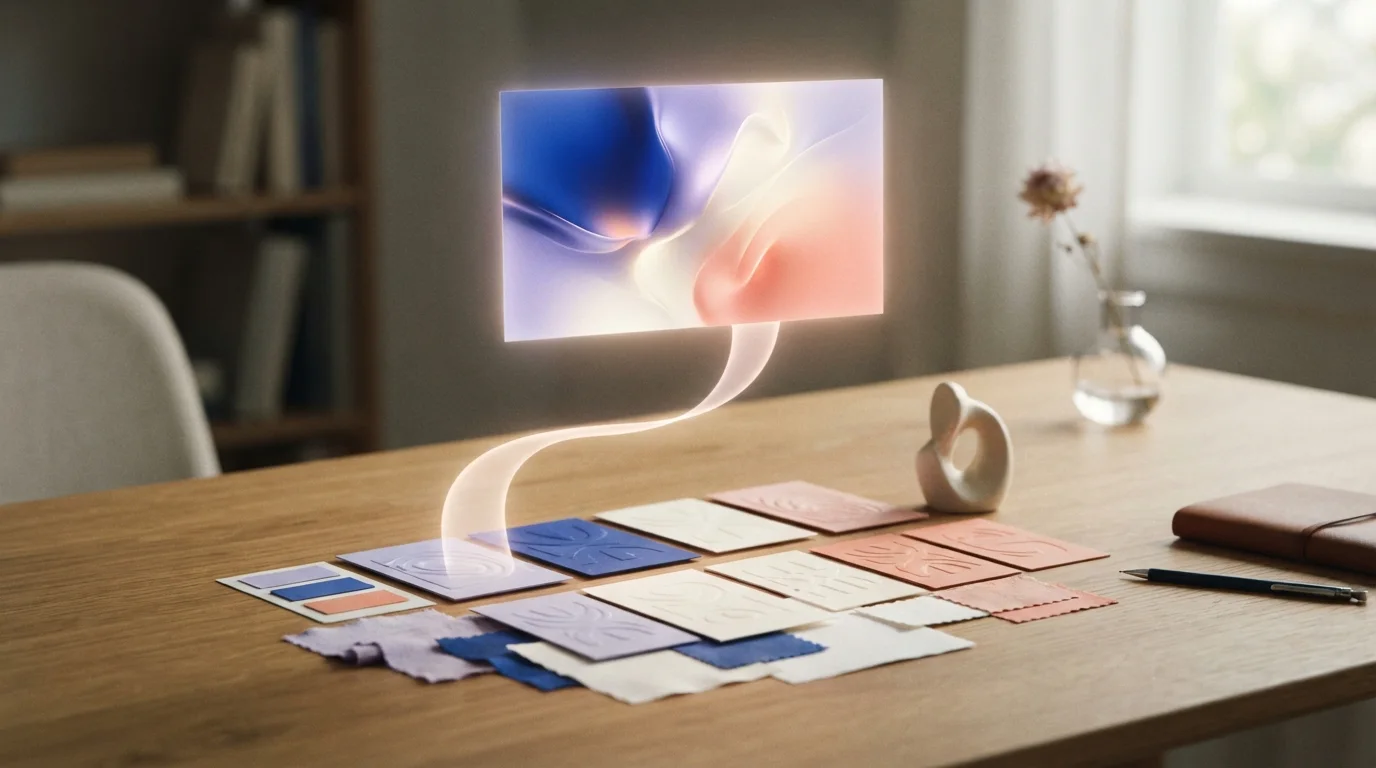
Start with the creative decision you already have
You do not need a fully formed prompt to use the Gallery. You may know only that you want a quiet portrait, a tactile product image, a surreal landscape, or a particular kind of lighting. Begin with the collection that comes closest to that starting point.
The categories are designed around the visual decision people tend to make first. Some begin with a subject or use case; others begin with a style, technique, atmosphere, or point of view. Choose the route that gives you the most useful first filter, rather than trying to find a perfect match immediately.
How the Gallery is categorized
The top-level collections provide broad ways into the library. Their subcategories narrow the direction so you can compare examples that share a more specific visual language.
- Subject and use case: what the image is for or what it centers on, such as a portrait, product, editorial scene, or restoration task.
- Style and atmosphere: the image's overall character, including cinematic, minimal, nostalgic, soft, dramatic, or playful directions.
- Technique and composition: the visible choices that shape the frame, such as a close crop, overhead view, mixed material, controlled studio light, or a particular rendering approach.
- Theme and context: cultural, seasonal, fantasy, or narrative directions that give the image a setting and point of view.
Read an example as a creative brief
When an image catches your eye, open it rather than relying on the thumbnail. The detail page records the prompt, model, provider, aspect ratio, and other generation details. Together, these show both the direction and the conditions used to test it.
Look for the parts that are doing the most work. Is it the low camera angle, the soft window light, the limited palette, the material, or the amount of empty space? Those details are more useful than a broad label such as ‘beautiful’ or ‘cinematic.’
Keep the anchors; replace the rest
A reference works best when you treat it as a set of choices, not a finished answer. Pick two or three creative anchors to preserve, then deliberately replace the ingredients that should belong to your project: subject, context, color story, format, or audience.
For example, an image of a perfume bottle may be useful because of its hard side light, cobalt backdrop, and oversized crop. Those same choices could become a drink can, a book cover, or a skincare still life without repeating the original picture.
Use the saved settings as evidence, not rules
The recorded model and aspect ratio make an example easier to reproduce, but they are not the only way to use it. Different models interpret the same words differently, and a ratio that works for an editorial image may not suit an ad, social post, or presentation.
Start with the settings when you want a close test. Change them when your own brief requires a different format. After generating, revise one important variable at a time so you can learn which detail actually changed the result.